SF Skate Club Website Redesign
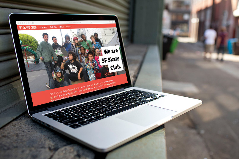
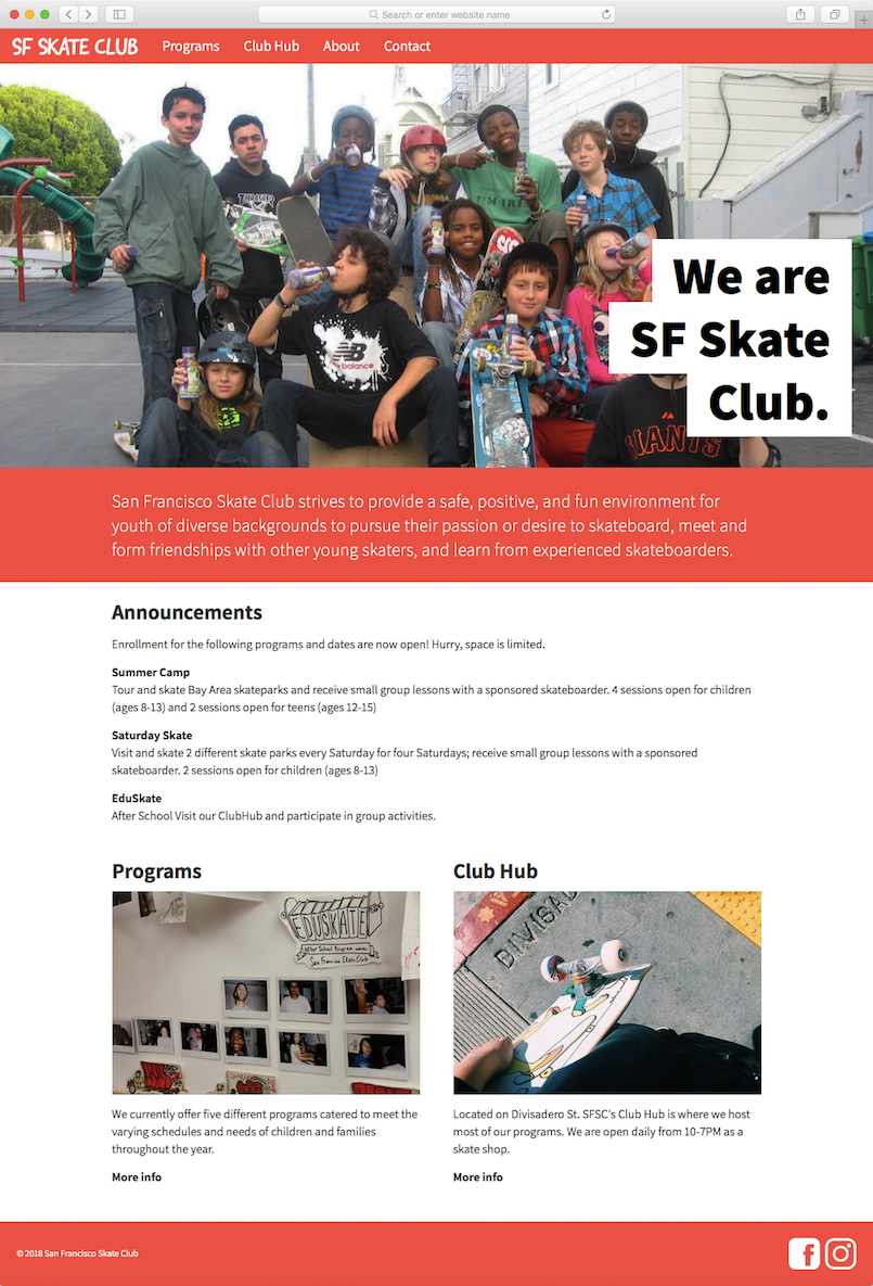
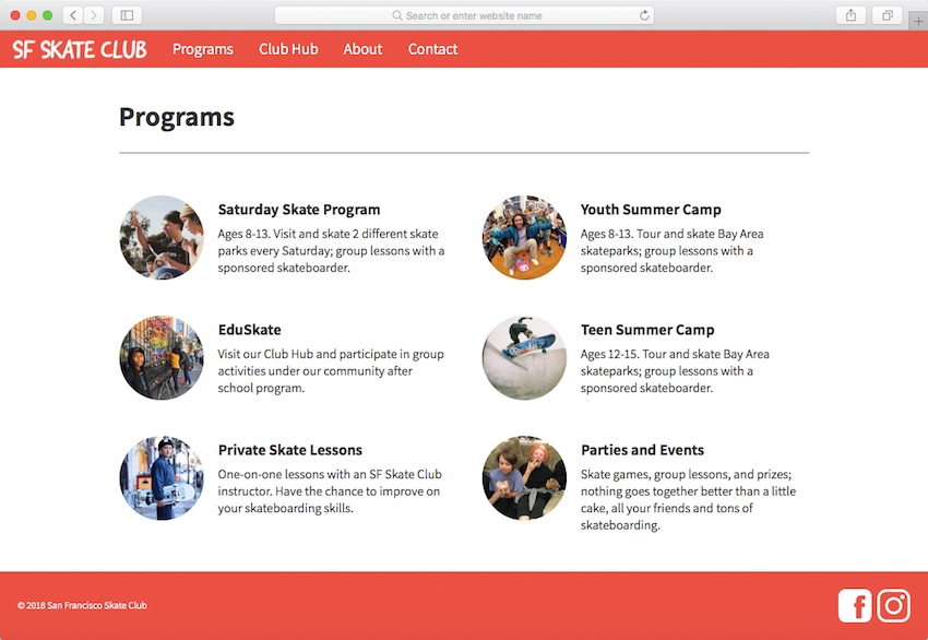
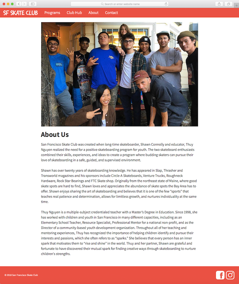
My classmate Qiqi Narag and I redesigned the website for SF Skate Club, a local business that offers skateboarding camps, lessons, and related resources to San Francisco’s youth. While the assignment was hypothetical and not an actual rendering of services, our redesign was comprehensive; the end result is a functioning 11-page website, hand-coded with HTML and CSS. It features overhauled branding—logos, colors, and type—and compatibility across all devices. I have hosted the complete site here.
We first sat down with Shawn Connolly, pro skater and one of two masterminds behind SF Skate Club, and interviewed him about what he’d want out of a new website. His complaints about the current site (pictured below) were that it was a “rush job” and out of date. He also said that the target user is parents interested in getting their kids involved with the club’s activities, and would want the design to reflect that.
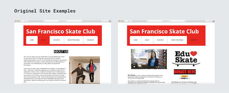
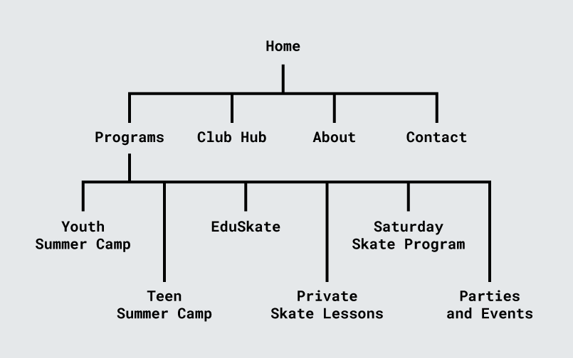
Our work began by parsing through the current site’s content and deciding how to structure it in the redesign. One issue we observed was an illogical organization to some of the pages, so we resolved this with a revised overall site structure, pictured below.
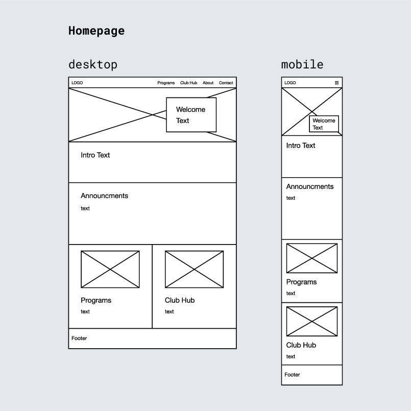
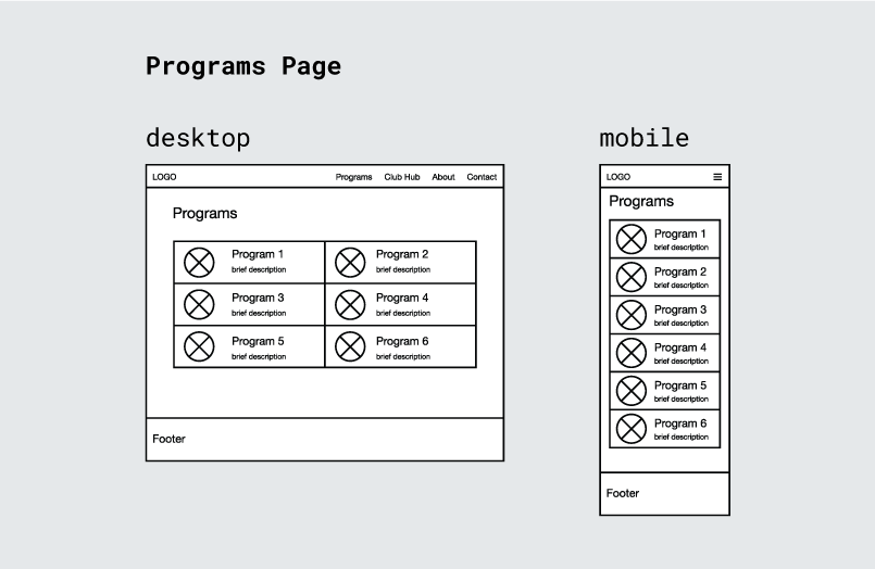
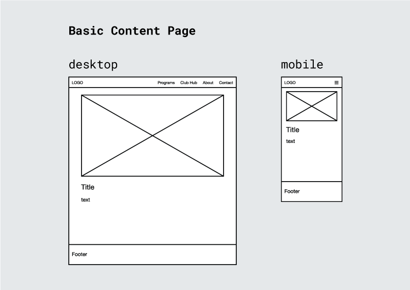
With the necessary pages figured out, we made wireframes for desktop and mobile sizes using Adobe XD. We realized a majority of our pages could be built off of a common template and simply filled in with unique content. This would modularize the entire project, speeding it up greatly.
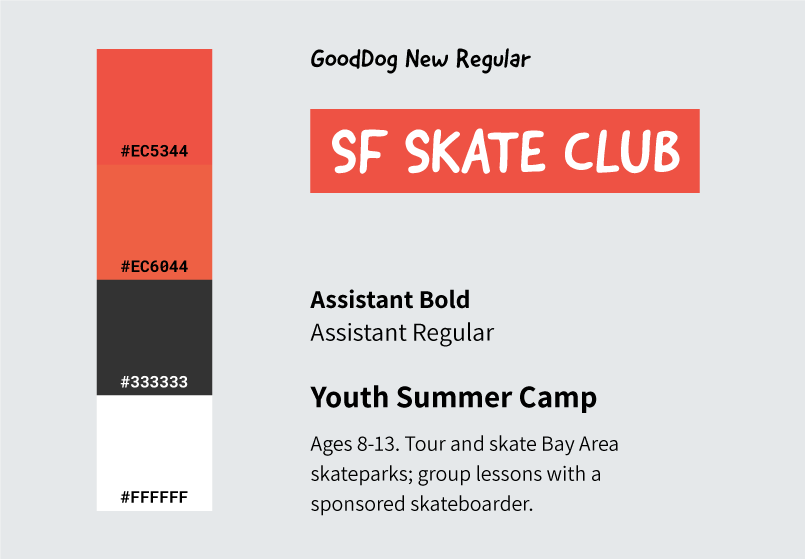
In formulating the new design, we kept in mind Shawn’s desire to gear the site towards parents. The handwriting-style font of the logotype lends itself to youthfulness as well the DIY culture of skateboarding. The vibrancy of the bright red from the original site lives on, although now through a unique red-orange.
With the groundwork all laid out, we set off creating the actual files. It was at this point we divided the task in a way that would ensure productive workflow; Qiqi amassed and modified text and pictures from SF Skate Club’s current site and social media accounts, and I did the bulk of the HTML/CSS writing.
The result is a complete 11-page site sporting a revamped, consistent design, greatly increased usability, and compatibility across all browser widths.
