Design Internship at HomeLight
I had the pleasure of spending a summer as Design Intern at HomeLight, a real estate tech company in San Francisco. I primarily worked on maintaining and expanding brand identity across a wide array of projects, digital and otherwise. In this page, I’ve highlighted three of those projects.
Jump to: Blog UI, Ebook, T-Shirt.
Blog UI
One of my projects was to make corrections to the outdated blog section of HomeLight’s website so that it would match the styling of the rest of the site. I used an a Sketch document of the old blog as a starting point and built up a refreshed, full-res mockup that could be handed off to engineers.
I additionally worked on exploring ways to restructure the blog’s navigation to accommodate for both “selling” and “buying” sections. HomeLight previously focused on home selling, but was in the process of expanding its product to appeal to home buyers as well.
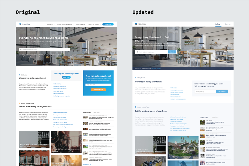
The original blog, shown below, reflected the seller-centric HomeLight of the past. There is no tab or section for buyers; the links in the top nav all lead to content for sellers.
My proposed modification to bring buyers' resources to the blog is below. I used Sketch and InVision to make an interactive prototype demonstrating my idea.
I repurposed the valuable real estate of the top nav to host Selling and Buying tabs—equally emphasized, and universally accessible throughout the blog. The sellers' links that used to occupy this space are moved into a full-width, expandable menu which offers the additional benefit of consolidating four drop down actions into one. To switch to content for buyers, one simply moves their cursor over to Buying.
Ebook
Another project I did was creating the design for an ebook geared towards first-time home buyers. In extending HomeLight's identity to this new touchpoint, I designed with brand consistency in mind.
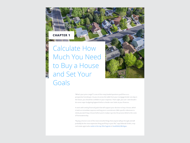
Chapter 1 is shown in the slides below, and as a PDF here.
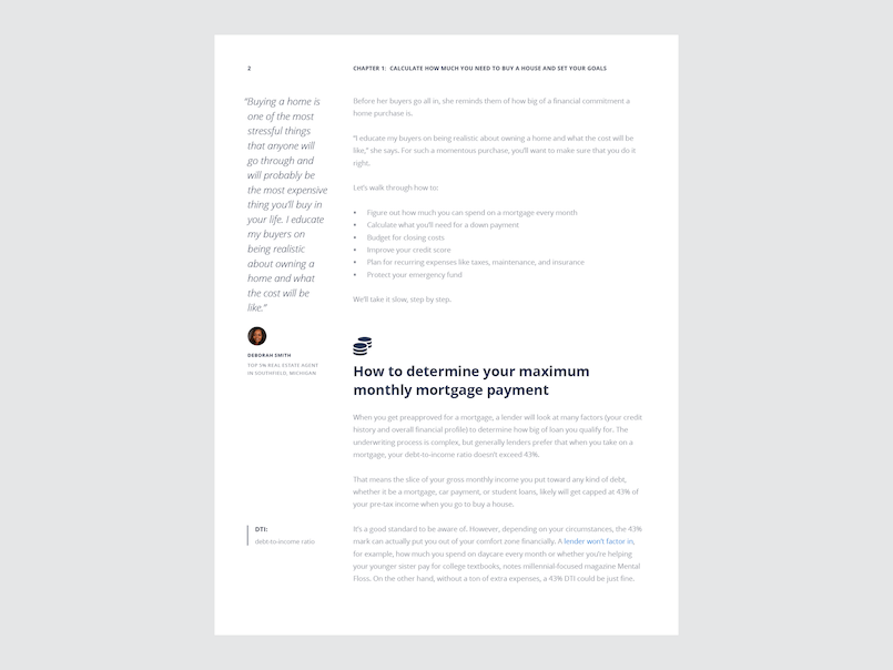
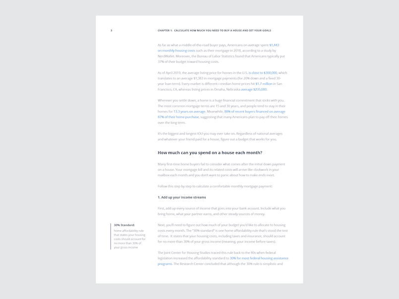
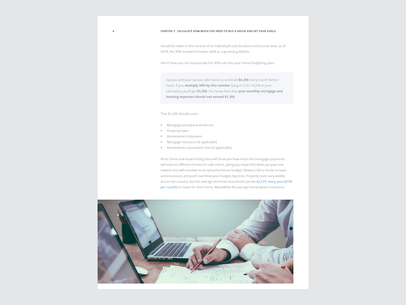
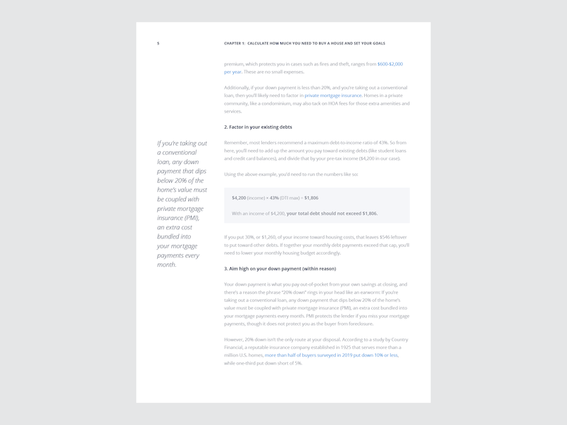
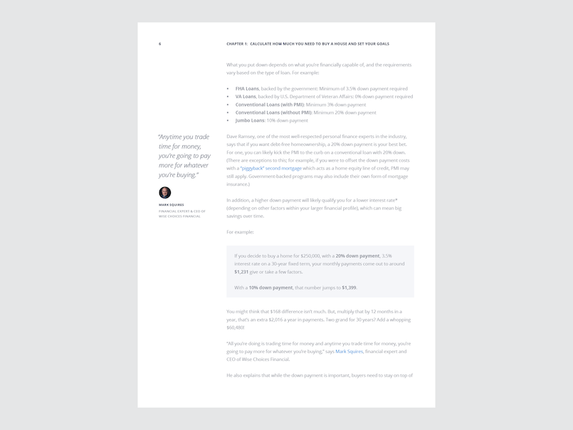
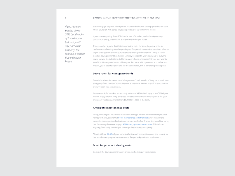
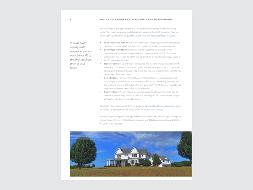
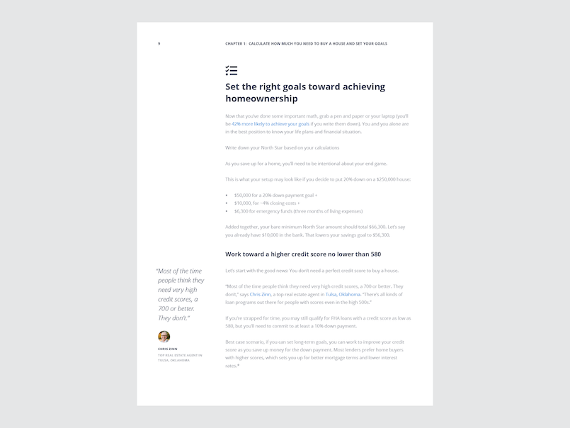
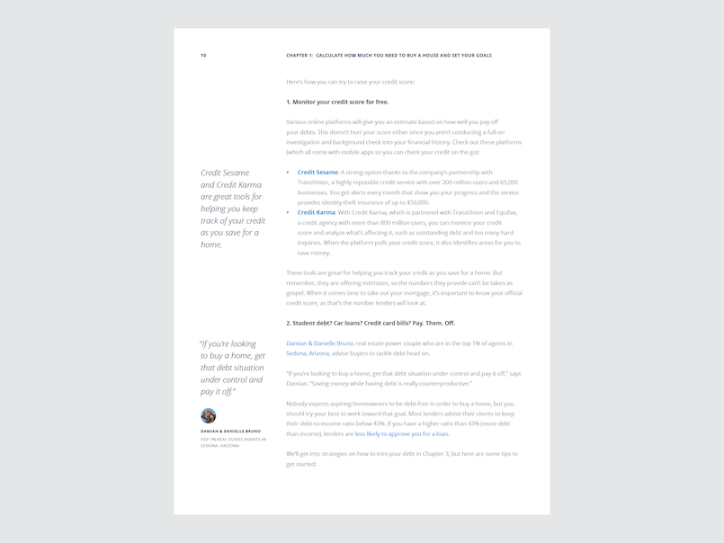
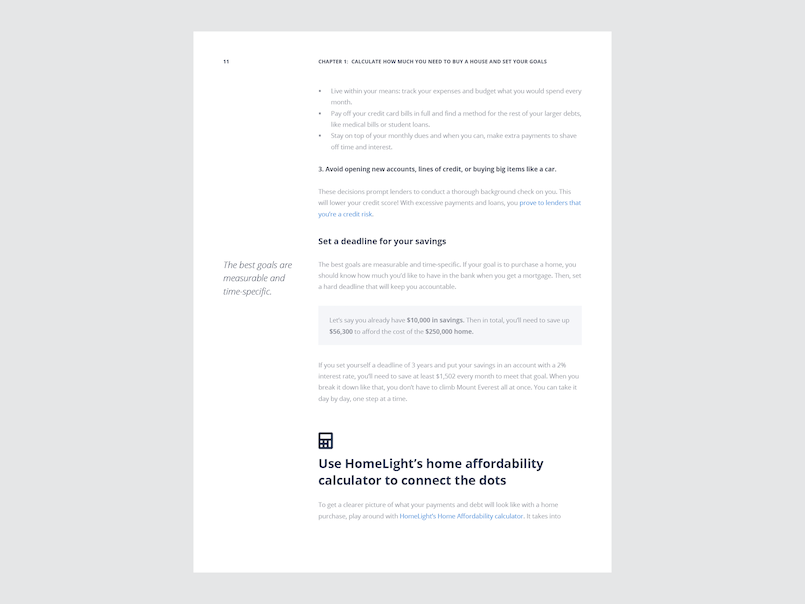
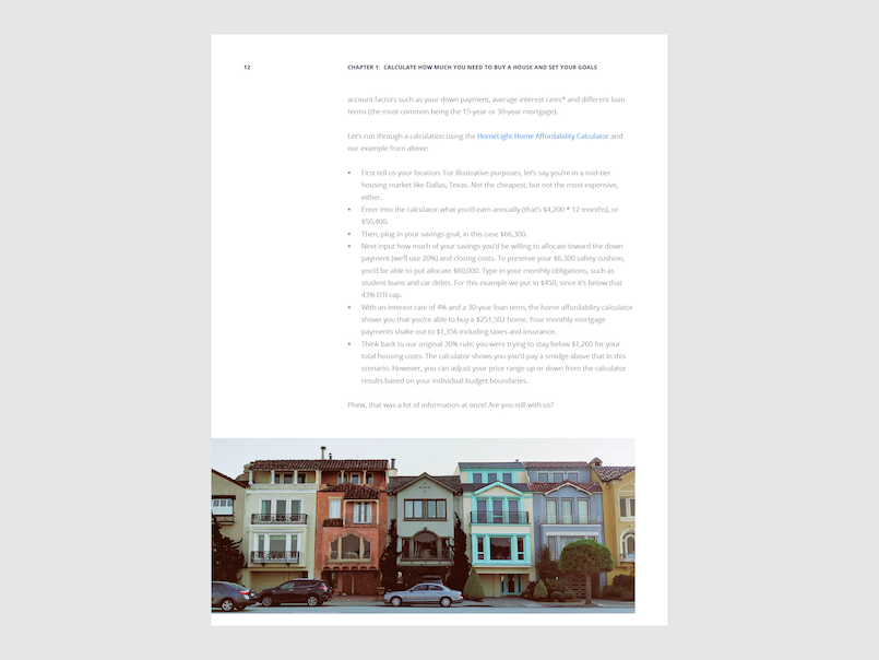
This was a typesetting-heavy project; the content team handed me a long document of plaintext copy, so my first step was to organize it. I devised a system of 14 paragraph styles in InDesign to give the content hierarchy, and I created a four-column baseline grid to plug it into. On top of the basic content, I incorporated a variety of additional features such as folios, pull quotes, definitions, and stock photography.
T-Shirt
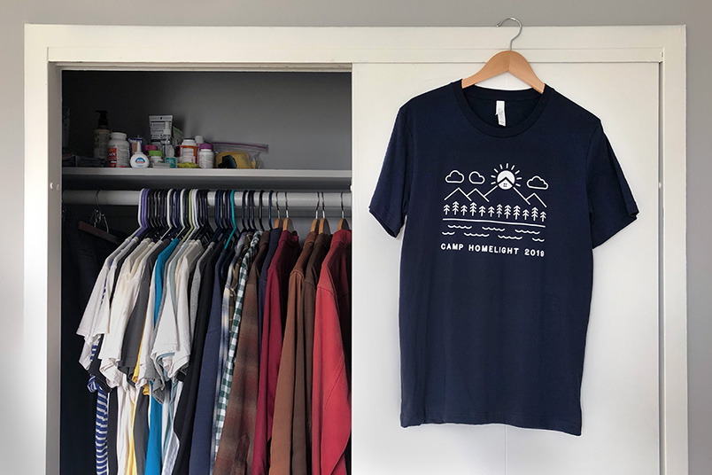
I was asked to create a t-shirt graphic for a company retreat to Lake Tahoe (that unfortunately did not coincide with my internship). The only real requirement was to incorporate the HomeLight logo.
I started with extensive sketching. I found mountain peak and sun imagery in the logo so I experimented a lot with creating a nature scene revolving around that.
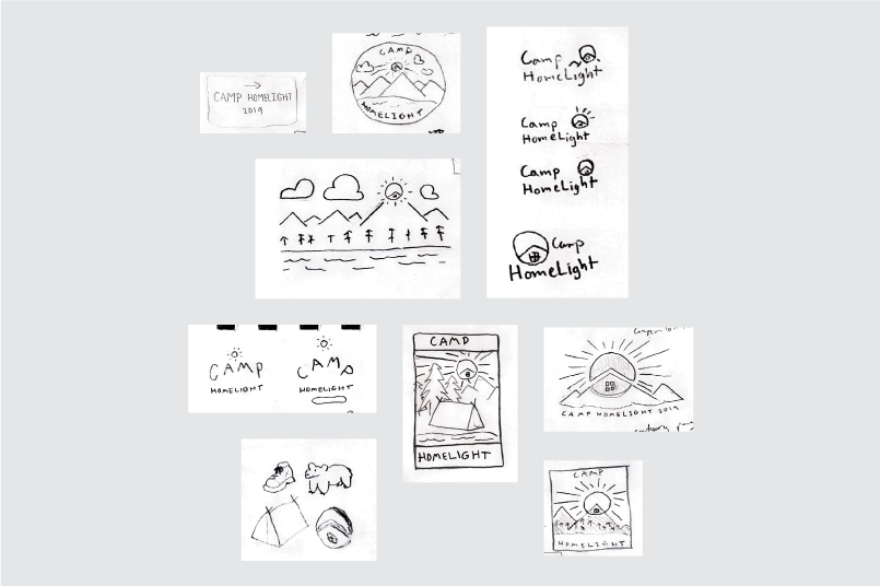
After sketching, digital iteration, and plenty of feedback from the other HomeLight designers, I put forward the following two directions for consideration:
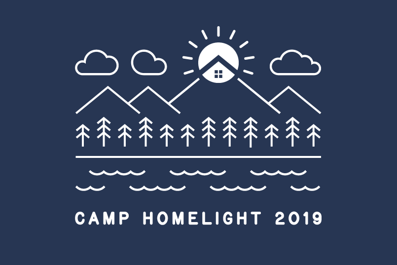
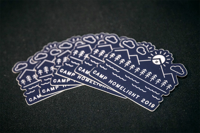
The line art nature scene was chosen, and printed in white to navy t-shirts. It also got made into a sticker.
So why am I propping up the other direction here in my portfolio? I like it better! As intern, I probably just thought it wasn't my "place" to insert my opinions—but now I understand that's exactly what designers are there for. My takeaway is to, moving forward, not be afraid to make a case for whatever work I feel is strongest.